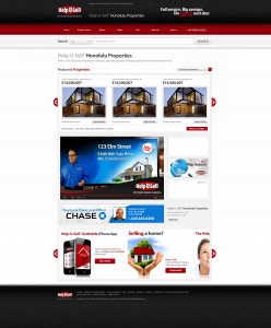
Thank you to our franchisees who have offered feedback on the new corporate site, which will launch very soon. We have made updates since our last Connect blog post about the site and are continuing to refine and adjust elements based on your input.
The biggest change is to the search function. We heard from you that you wanted it to be more prominent and easier for people to understand how to use. Our solution has made the search bar itself more visible by giving it a bolder border. We’ve also made it more intuitive to use by adding “Click here to Search for Homes” in the overlay of the search bar and incorporating the “Search Homes” button into the bar. A tutorial video with voiceover by James Dingman is in production and will offer a more detailed explanation of how to make the most out of the innovative search functionality. We have also included the Office Locator at the top of the homepage to facilitate users searching for their local offices.

In an informal poll at the end of this week’s Tech Time Tuesday, most franchisees wanted the new search function on their broker sites. By popular request, we are looking into replacing the guy pointing at the search bar with a different person or a couple.
The broker sites will also have the option of adding a smaller version of the carousel scroller at the bottom of the homepage above the footer. See the rough mock-up below for an idea of the layout.

Some of your site’s pages have been refreshed in the past week or two, including the home evaluation page and the press page. We are continuing to make improvements. Let us know what you would like to see on the corporate site and your broker site, in terms of additional modifications, and we will take those into consideration.
